Using Image Processing to Load Images in Hugo
Recently changed the theme to Clean White. One thing I noticed is that the header image is not responsive which causes it load a bit slow when viewing on other devices.
I’ve added media queries to load the necessary images using Hugo’s Image Processing feature depending on the device although I modified the theme as less as possible.
Resources
Hugo has a feature called Page Bundles which allows you to organize page resources for a post in a single directory:
content
└── post
    └── article-1
        ├── image-1.png
        ├── image-2.png
        └── index.md
This makes it easier to grab the Page Resources from the template although I’m not much of a fan of this organization as of the moment. I found this blog post which seem to fit my needs.
The idea behind is store the images in a directory that I can then reference from the template. Setup is pretty much the same from the blog post:
I’ve created the file “content/covers/index.md” and moved all the images (originally stored on “static/images/covers”) over to “content/covers” :
---
headless: true
---
I can then reference these images from the “single.html” template using this example:
{{ $page := . }}
{{ with .Site.GetPage "section" "covers" }}
  {{ with .Resources.GetMatch (strings.TrimPrefix "/covers/" $page.Params.image ) }}
    {{ $extraSmall := .Resize "768x" }}
    {{ $extraSmall.RelPermalink }}
  {{ end }}
{{ end }}
.Params.image is the default property that the theme uses to declare the header image.
Responsive Background Image
The theme uses Bootstrap 3 and I can use the default media queries as a reference on how I would use the images processing feature by Hugo for the sizes of the images. I’ve also used this blog post as a reference on how to load the background images depending on the device.
The theme has inline CSS in the template when declaring the background image URL per post. I just modified that part to make it in line with the current theme:
{{ if .Params.image }}
  {{ $page := . }}
  {{ with .Site.GetPage "section" "covers" }}
    {{ with .Resources.GetMatch (strings.TrimPrefix "/covers/" $page.Params.image ) }}
      {{ $extraSmall := .Resize "768x" }}
      {{ $small := .Resize "992x" }}
      {{ $medium := .Resize "1200x" }}
      {{ $large := .Fill "1920x516 center" }}

      @media (max-width: 767px) {
        header.intro-header {
          background-image: url('{{ $extraSmall.RelPermalink }}')
        }
      }

      @media (min-width: 768px) {
        header.intro-header {
          background-image: url('{{ $small.RelPermalink }}')
        }
      }

      @media (min-width: 992px) {
        header.intro-header {
          background-image: url('{{ $medium.RelPermalink }}')
        }
      }

      @media (min-width: 1200px) {
        header.intro-header {
          background-image: url('{{ $large.RelPermalink }}')
        }
      }
    {{ end }}
  {{ end }}
{{ else }}
  header.intro-header {
    background-image: url('{{ .Site.Params.header_image | relURL }}')
  }
{{ end }}
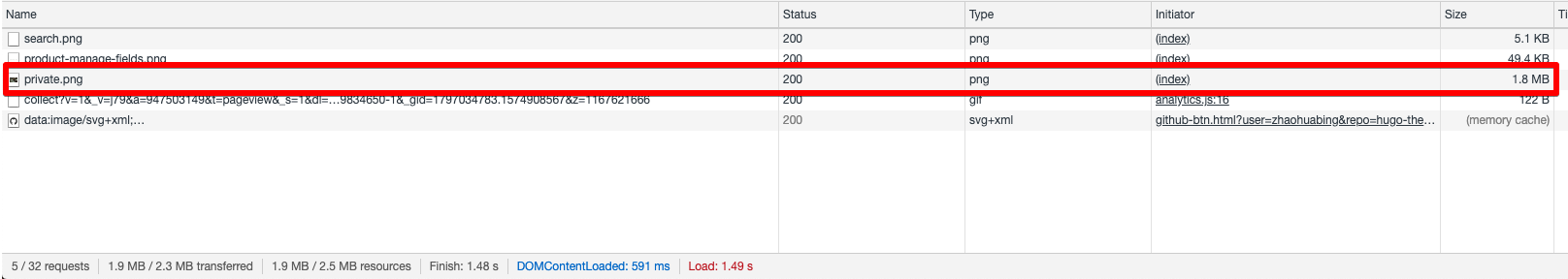
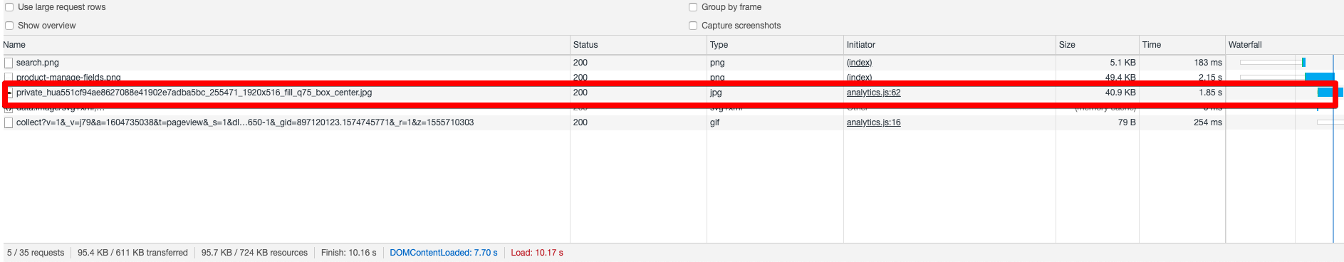
Using this technique, only the right images are loaded depending on the device.
Before:
After:
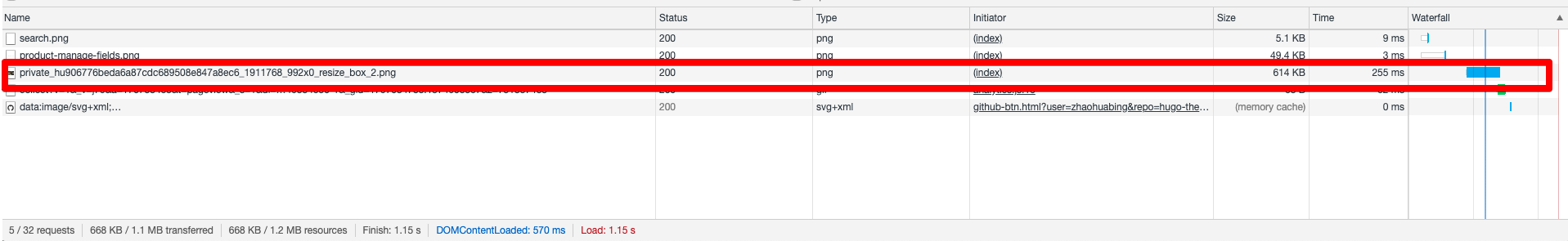
Not sure if this is the correct way to benchmark this although I am very much satisfied with the loading time result of the images.
Compressing the Images
The photos I’ve used are also from Unsplash. The original images are very large and simply resizing them doesn’t do much on the filesizes. I’ve used Gimp to export the images as JPEG with the quality lessen. The difference in the quality is not very noticeable but the the file size is.
So far the header images load faster than before now.